Search box
The textbox is an area where the user can type in and edit text. It can contain both values and one or multiple lines of text.
Variations
The textbox can be used in a standard version and with steppers.
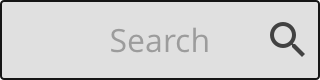
The placeholder texts describes the value or text that should be inserted. Usually it does not need to be labeled.
Specs
Describes how the search box is built up and styled.

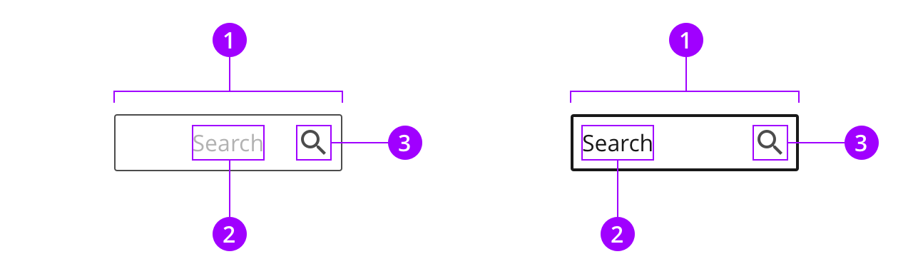
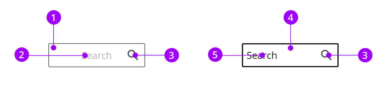
Anatomy
The search box is a version of the textbox, but with a centered label and a search icon on the right side of the box.
Colors
The search box uses the normal style.
Typography and icons
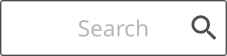
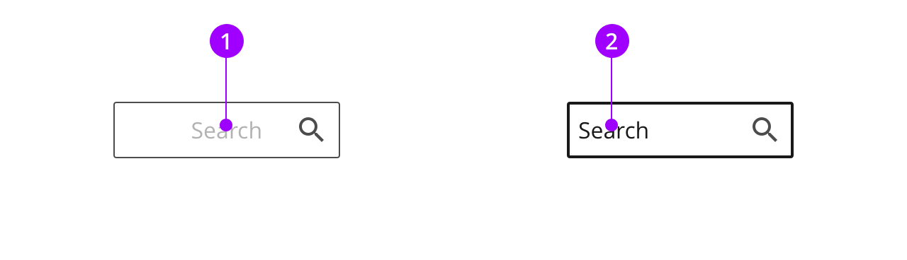
The alignment of the text varies based on type and state of the search box. When the search box is selected and you start typing, the text becomes left-aligned.
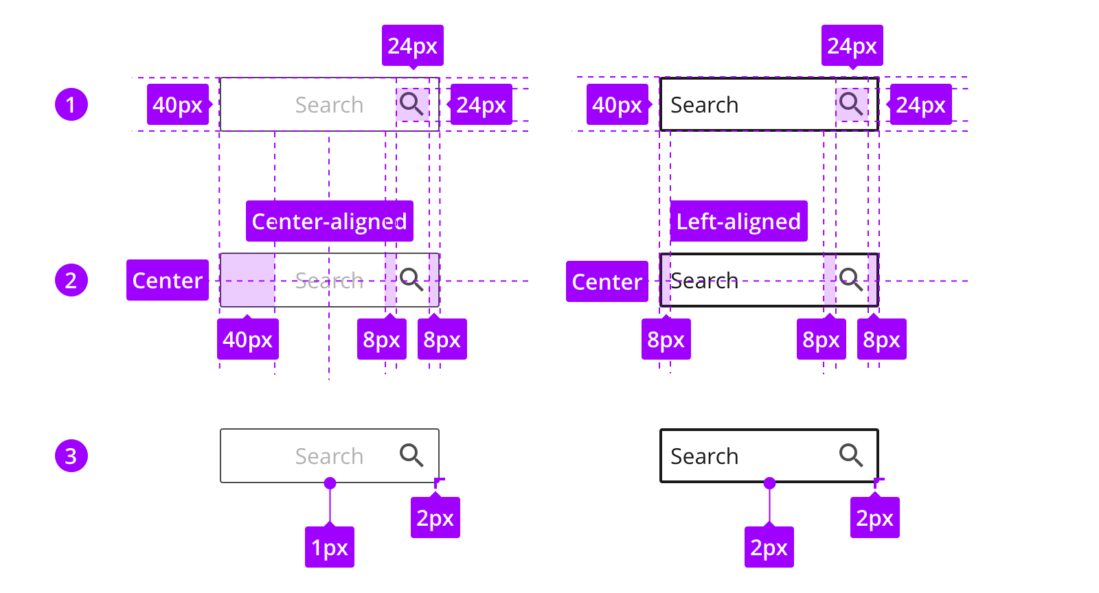
Measures and spacing
The search box uses the the same height as buttons to make sure its clickable. The width can be customised to fit its content and space in interface.
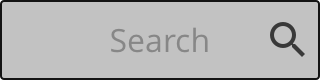
States
The look of the states are defined by the style.