OpenBridge
Design Guidelines

Dropdown

A dropdown is a selection control where the user can pick one of multiple options. It is often used when there is no room for a toggle button.

Variations

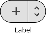
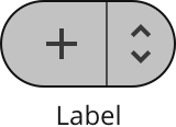
The dropdown can be used with and without an icon.

Standard dropdown

The standard dropdown displays the option currently selected.

Icon dropdown

Mostly used in containers where it is placed together with icon buttons.
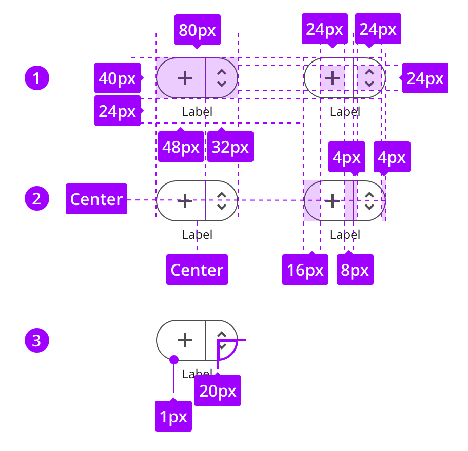
Specs

The next steps explains how the standard and icon dropdown are built up and styled.
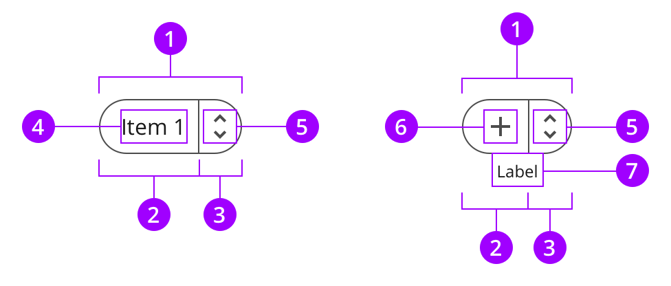
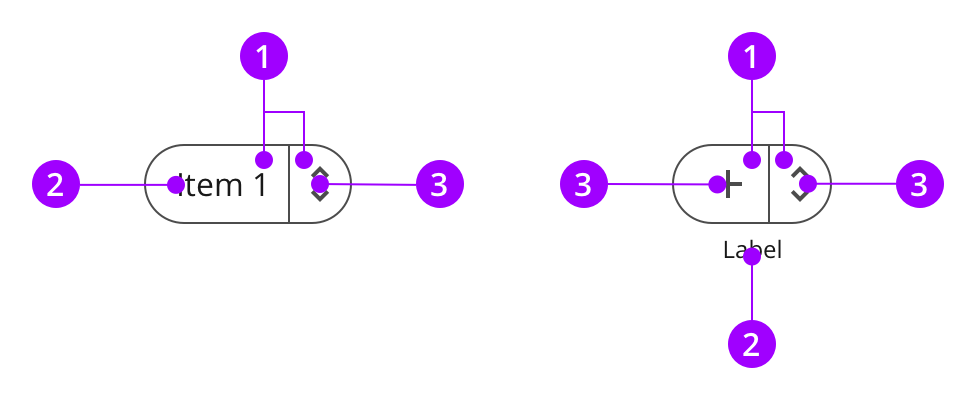
Anatomy

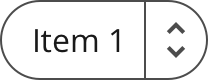
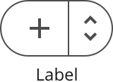
A dropdown is built up by a container framing a label and an icon.

Components
1
Dropdown container
2
Label container
3
Icon button container
4
Label
5
Icon

Colors

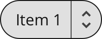
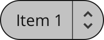
The dropdown uses the normal style.

Element
Color / Style name
1
Container
style-normal-enabled
2
Text
color-on-background-active
3
Icon
color-on-background-neutral

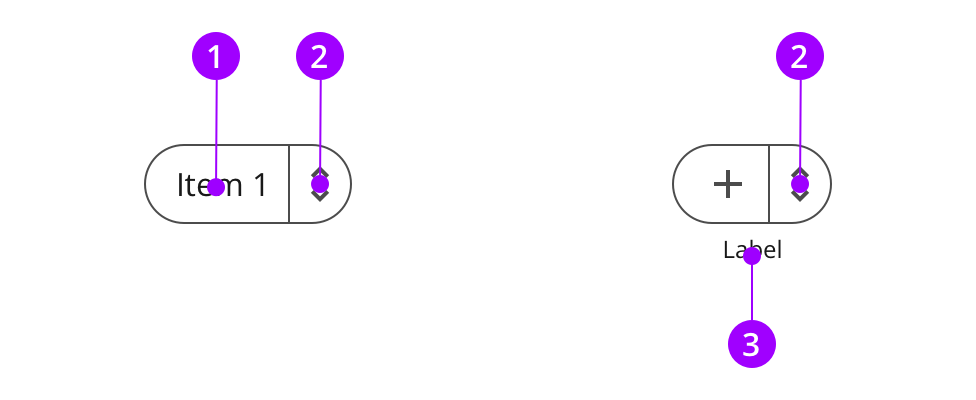
Typography and icons

The label text describes the button. The arrow icon is a part of the menu button, indicating that it expands a menu, and not should not be changed.

Text category
Text attributes
1
Body
Aa
Typeface: Open Sans
Weight: Regular
Size: 16px
Line height: 24px
2
up-down-icon
Typeface: Open Sans
Icon container width: 24px
Icon container height: 24px

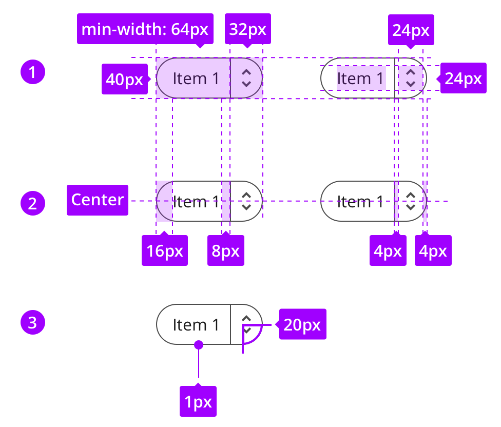
Measures and spacing

The dropdown uses the button height, and has completely rounded edges.
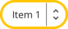
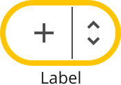
Standard dropdown button
1
Component measures
2
Spacing
3
Border sizes
Icon dropdown button
1
Component measures
2
Spacing
3
Border sizes

States

The look of the states are defined by the style.

Standard dropdown button
Enabled
Container
style-normal-enabled
Hover
Container
style-normal-hover
Pressed
Container
style-normal-pressed
Focused
Container
style-normal-focused
Disabled
Container
style-normal-disabled
Icon dropdown button
Enabled
Thumb
style-normal-enabled
Hover
Thumb
style-normal-hover
Pressed
Thumb
style-normal-pressed
Focused
Button container
style-normal-focused
Disabled
Button container
style-normal-disabled
Button text
color-on-background-disabled