Styles and states
The interactive components in OpenBridge is formatted using styles and states.
A state is the behavior of an interactive element in various stages of interaction. It will change visual appearance when a mouse cursor is hovering over it or when it is pressed.
A style is a visual formatting of an interactive element. For instance, a raised button is visually emphasized compared to a normal button. Both of the styles will be affected by changes in interactive states.
The visual appearance of styles in various forms of states are described as a color area and the color and width of a line around it. This format is applied to the forms of various user interface components.Under each UI components in the components section, there is a description of which state and style combination each component use.
List of styles
List of styles used in the design system. Use the palette switcher above to se definitions for each palette.
Component styles
The component styles are used across the UI components to give a consistent look related to their functions.
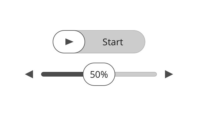
Raised
Raised is used for high emphasis buttons and components, and other actions you want to highlight in the view.
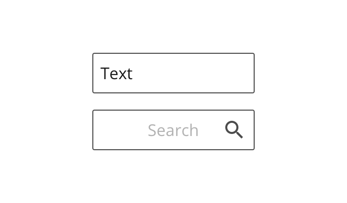
Normal
Normal style is used for most components to keep a neutral look, and where it is important that the text inside is readable or the content inside frequently changes, like textboxes and dropdowns.
A normal styled element does not only have a stroke, but also a solid fill in the palettes container-background color. This is to keep the readability regardless of the surface it appears on.
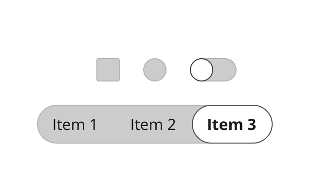
Indent
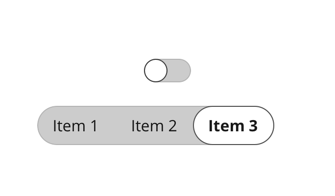
Indent is used for unchecked elements, like unchecked checkbox, radio button and toggle button, or areas that can be filled like in the track of a slider.
Flat
Indent is used for unchecked elements, like unchecked checkbox, radio button and toggle button, or areas that can be filled like in the track of a slider.
Selected
Indent is used for unchecked elements, like unchecked checkbox, radio button and toggle button, or areas that can be filled like in the track of a slider.
Thumb
Indent is used for unchecked elements, like unchecked checkbox, radio button and toggle button, or areas that can be filled like in the track of a slider.
Colors
The OpenBridge Design system organizes colors into types of colors reflecting the function each color has in an application. This makes it easier to develop and change between in a more consistent way.
In the OpenBridge Design System we are working on a predefined palette set for bright, day, dusk and night. The goal is to develop palettes that both meets class regulations and OpenBridge requirements. The palettes also works as examples on how to use the color system.
Colors
A list with all base Colors in the design system.
UI colors
The UI colors are used to highlight dynamic data, active elements, selected components, components in use, and more. It is a pair of two colors - one used to display output data and current system state, and one to display user input waiting for the system to respond.
Dynamic color
The main color in the color system is the dynamic color. This is used for active elements like dynamic instrument data texts and graphics.
User input color
The input color is used for situations where the system needs time to respond to the users input, and you want to display both the user input value and the current value in the system.
Alert colors
The alert colors is used to highlight the different levels of alerts displayed in the system. This is four main levels of alerts: Alarm, warning, caution and OK/ Running. This is a category of colors that is regulated, and have to be a specified type of color.
Running color
The running color is used for processes where it is important that the process is running properly, and has a "running" state. This can be processes with startup time, where there is important to signify the difference between a starting process and a running process.
Caution color
The caution color have to be yellow. Make sure the yellow color is easy to separate from the warning color, but does not blend into the background color.
Warning color
The warning color have to be orange. Make sure the orange color is easy to separate from the alarm color.
Alarm color
The alarm color is only used for system alarms. This have to be a unique color to make it visually stand out in the interface when an alarm pops up in the system. Due to regulations, this color have to be red.
Surface colors
The surface colors are used as backgrounds behind text and elements. There are different surface colors to separate different areas related to different levels in the user interface. By separating into different areas you make it easier to structure the content in the UI, and to give the components a context.
Backdrop surface
The backdrop surface color is only used when there are multiple background colored areas associated with different functions. This could be as a background in widget areas, where the widgets are separate functions with no direct relation.
Background surface
The Background surface color is the most used and most dominant surface color in the system. The main area where the content and information in each application will be displayed uses the background color.
Section surface
The Application level surface color should be used for side and bottom bars. This is mainly areas where there user can do actions to interact with the application, like settings, configuration, zooming etc. This color is used for separating application level-functionality from global menus.
Global surface
The Global surface color is used for areas related to the topmost level in the application hierarchy, where you can access global functions and navigate through the top level in the application.
Borders
There are different kind of borders with different purposes used in the system: Outlines and Dividers. Outlines are used to separate content with no relation, and dividers are used to separate related content. The Outline border should be more visible and clearer than the divider color.
Outline
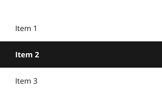
Outlines are used to separate content from each other to make it easier for the user to understand the relation or non-relation between content displayed on the same screen. The combination of using surface colors and outlines will create natural sections and hierarchy to the content displayed at the same time.
Divider
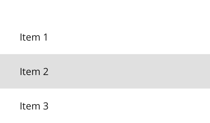
Dividers appears between equal elements. In situations where there are list items with multiple columns in a row (for instance an icon + label item), and the distance between the rows is relatively equal or smaller than between the columns, a divider can be used to separate the list items.
On background
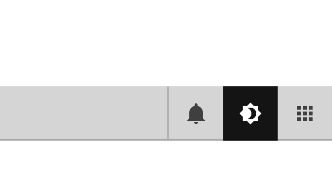
The OnBackground color is the inversed version of the background color (white on black background and black on white background). It is used for icons, static elements and text throughout the UI. The OnBackground color appears in four different levels: Active, Neutral, Disabled and Hinted.
Active
Used for active elements like text, selected icons, headings and static instrument text. Elements that are static but needs to be highlighted in the UI.
Neutral
Used for static, unselected icons and elements.
Disabled
Disabled text and elements that are disabled / unavailable.
Hinted
Not used for text, but as a background color in graphical objects.
On primary
The OnPrimary color is used on text and elements displayed on top of a primary colored surface to make sure that the text or element has sufficient contrast to the primary color.
Active
Show alarm color in use
Normal
Show warning color in use
Disabled
Show warning color in use