OpenBridge
Design Guidelines

Navigation menu

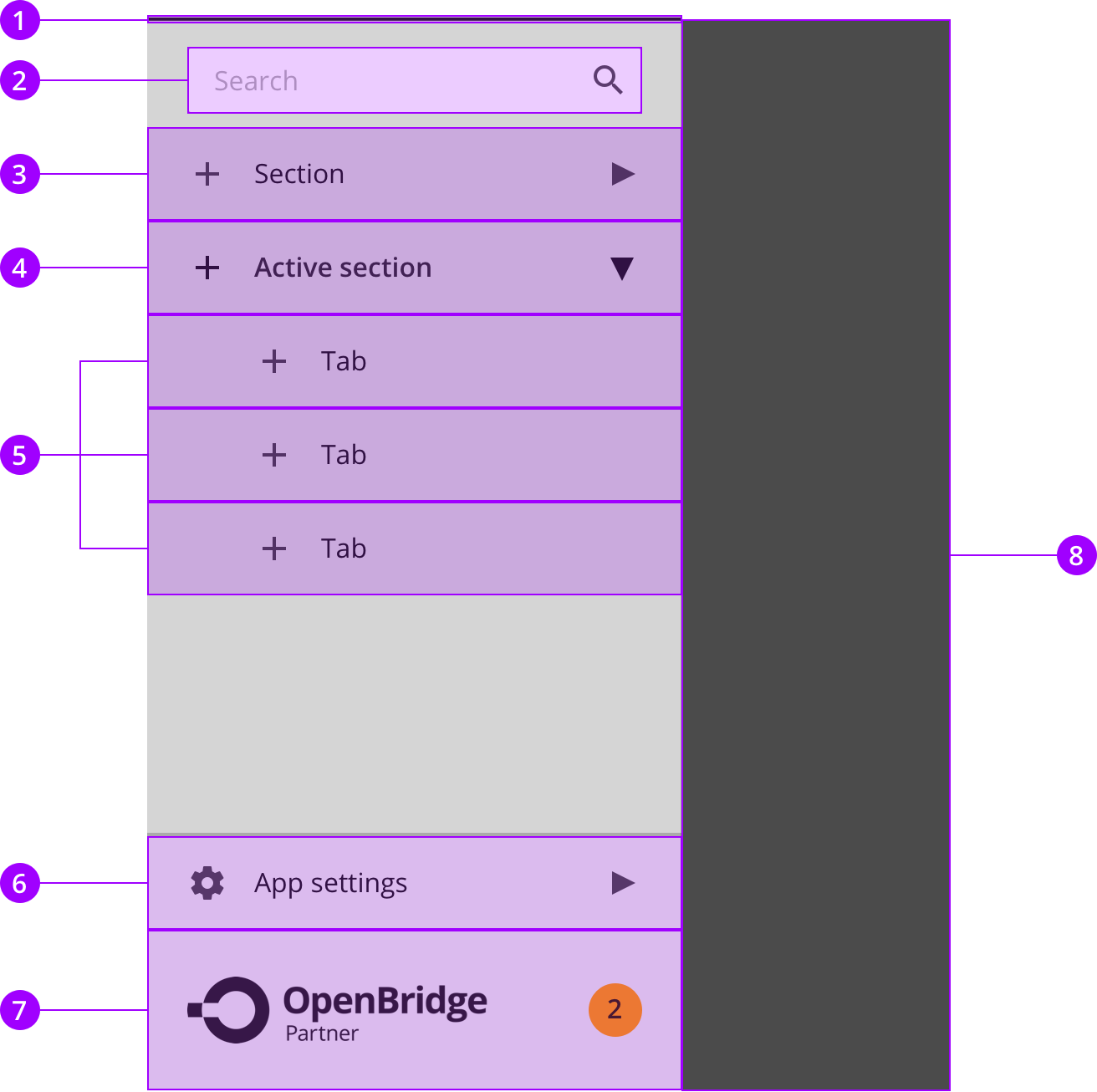
The navigation menu offer quick access to the main pages in the application including and optional search box. The list can include nested entries that can be expanded in the menu. In the lover corner of the navigation menu is access to application settings and a vendor menu.
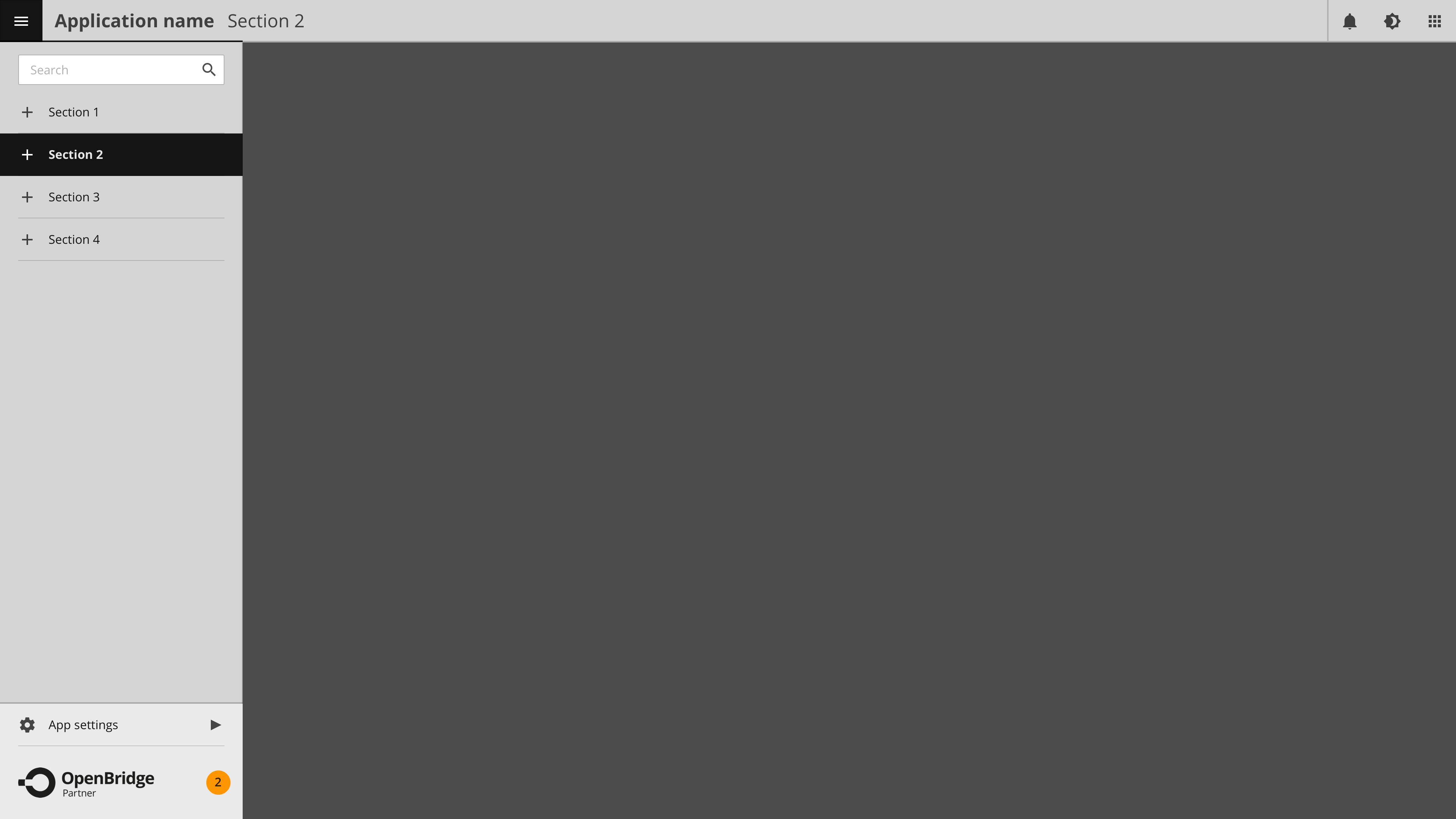
In use

The top bar are present on all applications and offer a consistent way for accessing critical functions in an application. It consist of a navigation menu, application label aligned to the left.

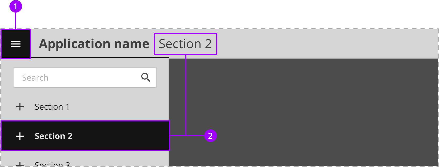
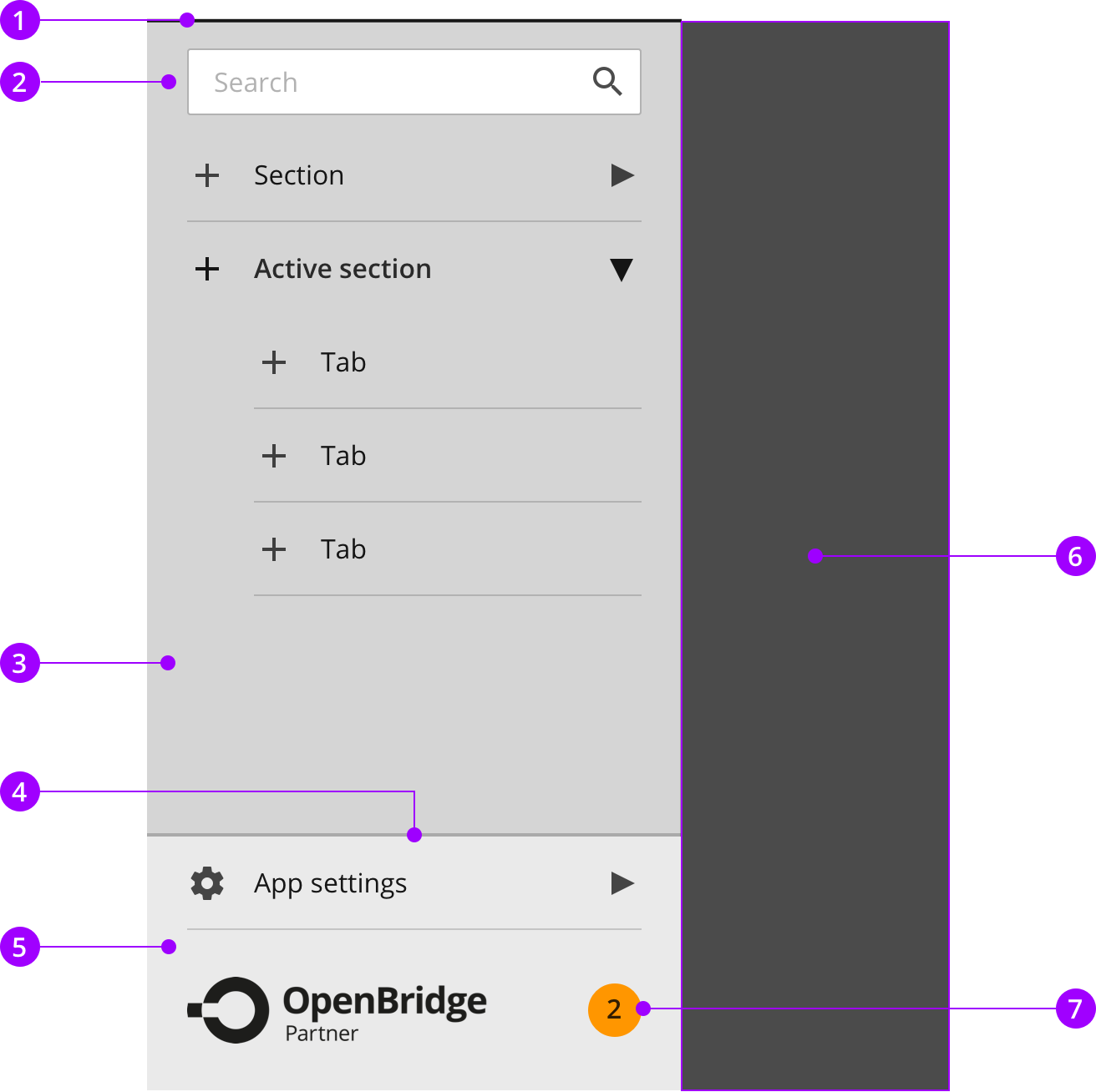
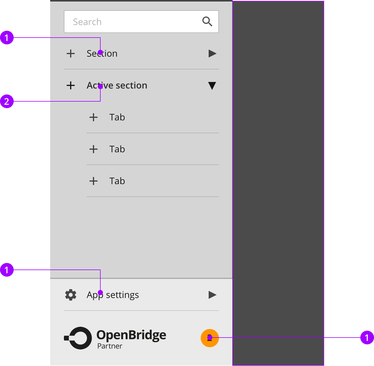
Navigating between sections in the navigation menu

1
When the hamburger button is pressed, the hamburger menu is displayed. The topbar button should remain in the active state as long as the navigation menu is open.
2
The current section are displayed in an active state, as well as in the topbar. When another section is pressed, the navigation menu will close and navigate to the selected section.

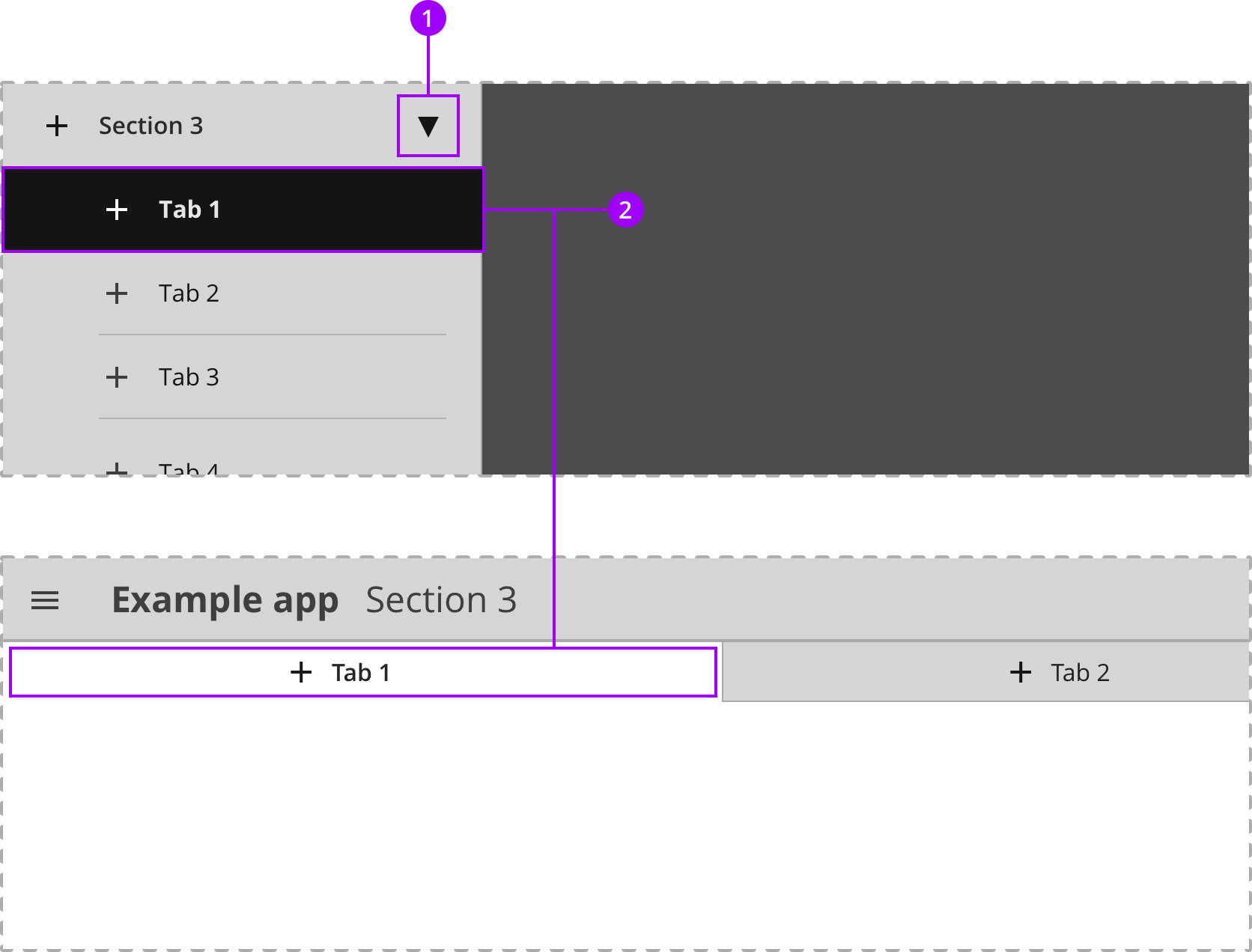
Navigating between tabs in the navigation menu

1
When the hamburger button is pressed, the hamburger menu is displayed. The topbar button should remain in the active state as long as the navigation menu is open.
2
The current section are displayed in an active state, as well as in the topbar. When another section is pressed, the navigation menu will close and navigate to the selected section.

Navigating to application settings and vendor support and documentation.

1
App settings button is placed at the bottom of the hamburger menu.
2
The current section are displayed in an active state, as well as in the topbar. When another section is pressed, the navigation menu will close and navigate to the selected section.

Anatomy

The top bar are present on all applications and offer a consistent way for accessing critical functions in an application. It consist of a navigation menu, application label aligned to the left.

Components
1
Top border
2
Search box
Details
3
List item - Normal
Details
4
List item - Expanded
Details
5
List item - Sub item
Details
6
List item (Settings menu button)
Details
7
Vendor logo (Help, support and updates page)
Details

Colors

The top bar are present on all applications and offer a consistent way for accessing critical functions in an application. It consist of a navigation menu, application label aligned to the left.

Element
Color name
Color value
1
Top Border
on-background-active
rgba (0, 0, 0, 0.90)
2
Container
surface-global
rgb (213, 213, 213)
3
Divider
border-divider
rgba (0, 0, 0, 0.12)
4
Bottom section border
border-outline
rgba (0, 0, 0, 0.20)
5
Bottom section
surface-section
rgb (213, 213, 213)
6
Darken layer
on-background-normal
rgb (213, 213, 213)
7
Notification badge
alert-warning
rgb (255, 160, 0)
Bright palette

Typography

The top bar are present on all applications and offer a consistent way for accessing critical functions in an application. It consist of a navigation menu, application label aligned to the left.

Text category
Text attributes
1
Body normal
Aa
Typeface: Open Sans
Weight: Regular
Size: 16px
2
Body active
Aa
Typeface: Open Sans
Weight: Semi bold
Size: 16px

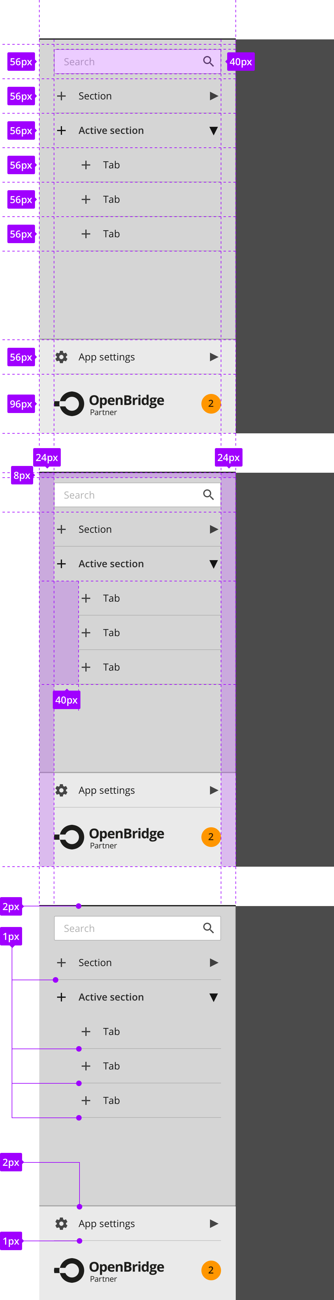
Measures and spacing

The top bar are present on all applications and offer a consistent way for accessing critical functions in an application. It consist of a navigation menu, application label aligned to the left.

1
Component measures
2
Spacing
3
Border sizes