Radio button
Radio buttons enables a single option in a list of options. It is often used if there are many options available, and all of them should be visible.
Variations
The checkbox can be displayed in the different main states.
Unckecked radio button
The unchecked radio button is an empty circle.
Checked radio button
The checked radio button is filled and displays a small dot in its center.
Specs
How the component are built up and styled in both unchecked and checked state.

Anatomy
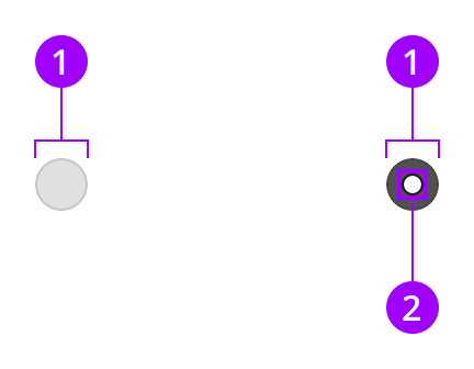
The radio button is built up by a container and a dot displayed in a checked state.

Components
1
Container
2
Dot
Colors
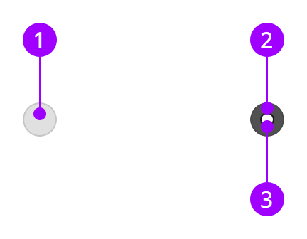
The container switches style when it is checked.

Element
Color / Style
1
Unchecked container
style-indent-enabled
2
Checked container
style-raised-enabled
3
Dot
color-on-primary-active
Measures and spacing
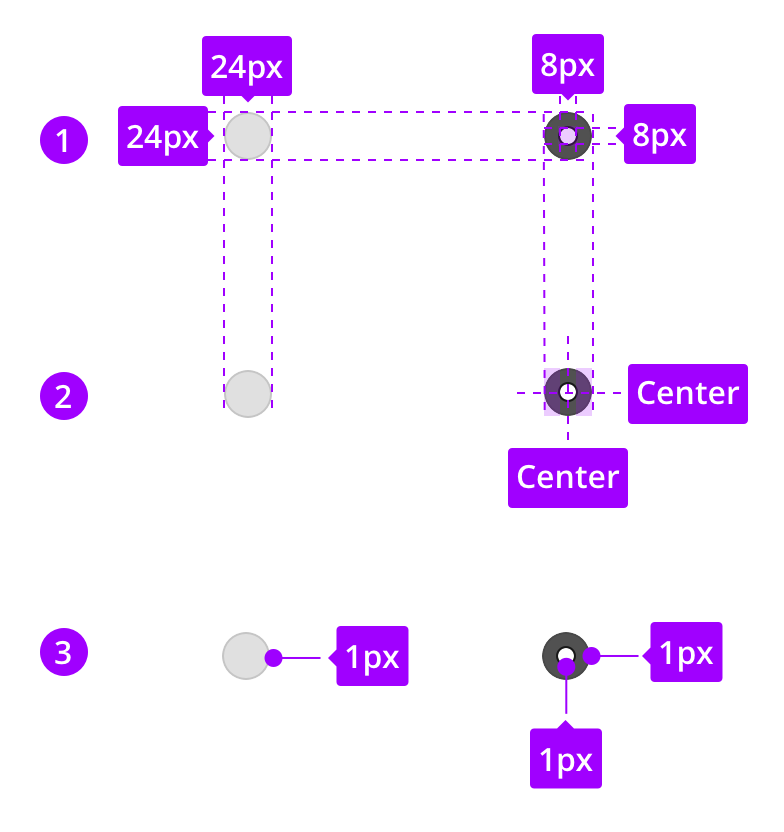
The measurements are the same in both unchecked and checked states, but the dot are only visible in the checked state.

1
Component measures
2
Spacing
3
Border sizes
States
The look of the states are defined by the style.
Unchecked
Container
style-indent-enabled
Hover
Container
style-indent-hover
Pressed
Container
style-indent-pressed
Focused
Container
style-normal-focused
Disabled
Container
style-thumb-disabled
On
Container
style-raised-enabled
Dot
color-on-primary-active