Alert notification
The Alert notification are displayed in the Topbar when an alert is activated.
Variations
The alert notification can be displayed in different versions based on the alert level.
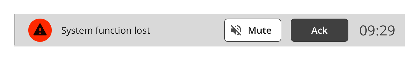
Topbar notification
The color and icon on the alert icon changes based on the alert level.
Specs
How the Alert notification are built up and styled.
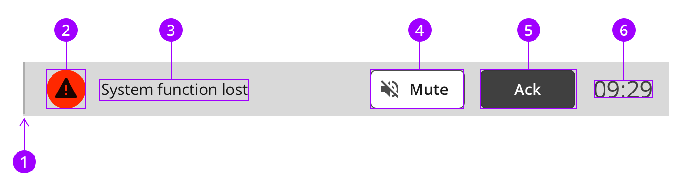
Anatomy
The alert notification is a nested component with text and UI components.
Colors
The Alert notification use standard colours for text and dividers. Go to the Alert icon page to see color definitions for the alert indicator.
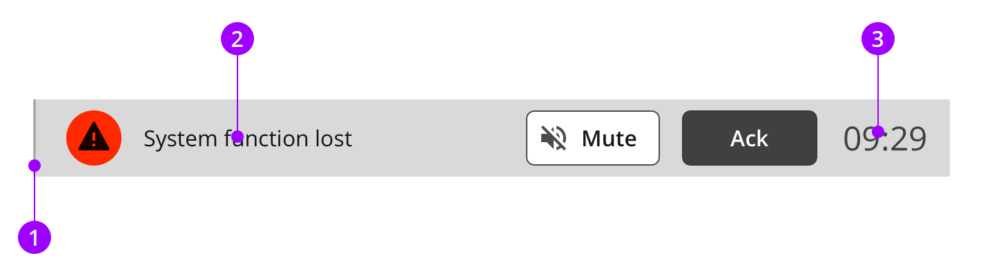
Element
Color / Style name
1
Border
color-border-outline
2
Alert text
color-on-background-active
3
Clock text
color-on-background-neutral
Typography and icons
The alert notification text uses body text, but the clock use the subtitle style.
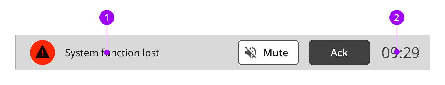
Text category
Text attributes
1
Body
AA
Typeface: Open Sans
Weight: Regular
Size: 16px
Lineheight: 24px
2
Subtitle
Typeface: Open Sans
Weight: Regular
Size: 24px
Lineheight: 32px
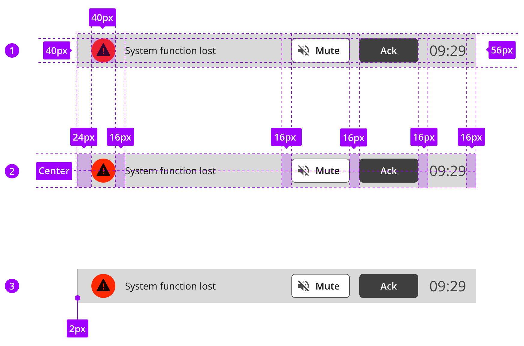
Measures and spacing
The width of the list item may vary based on the Topbar width.
1
Component measures
2
Spacing
3
Border sizes